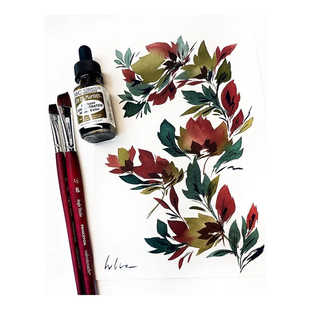
Work in progress on an art print
Take a look behind the scenes at the process of creating an original art print!
It all begins with color, as shown in the first video, where I’m testing out different colors
to find the perfect palette. Choosing the right shades is a crucial step in the design process.
For this piece, I played around with various greens before settling on two favorites:
a rich, dark sap green and a soft olive green. These earthy tones provide a beautiful contrast and a grounded feel.
To complement them, I added a third color—a deep bordeaux red—which creates a striking, wintery color palette.
The combination evokes a sense of warmth and nature, balanced by the cool elegance of the greens.
I’m using Dr. Ph. Martin’s Lightfast Inks for this project, ensuring the colors are not only vibrant but also archival quality.
These inks are designed to stand the test of time, so the final art print can be enjoyed for years without fading.
From testing colors to finalizing details, each step of this process is part of the creative journey.
Hope you enjoy watching!
Below is a timelapse capturing the process of creating an original art print using the carefully chosen winter palette.
After testing and selecting the colors—a deep sap green, a muted olive green, and a rich bordeaux red—
I was ready to bring the design to life.
This timelapse is a glimpse into the behind-the-scenes effort that transforms an idea into a tangible work of art.
I hope you enjoy watching the process as much as I enjoyed creating it!
This is the end result that is available in my shop!

