Endless shades of green
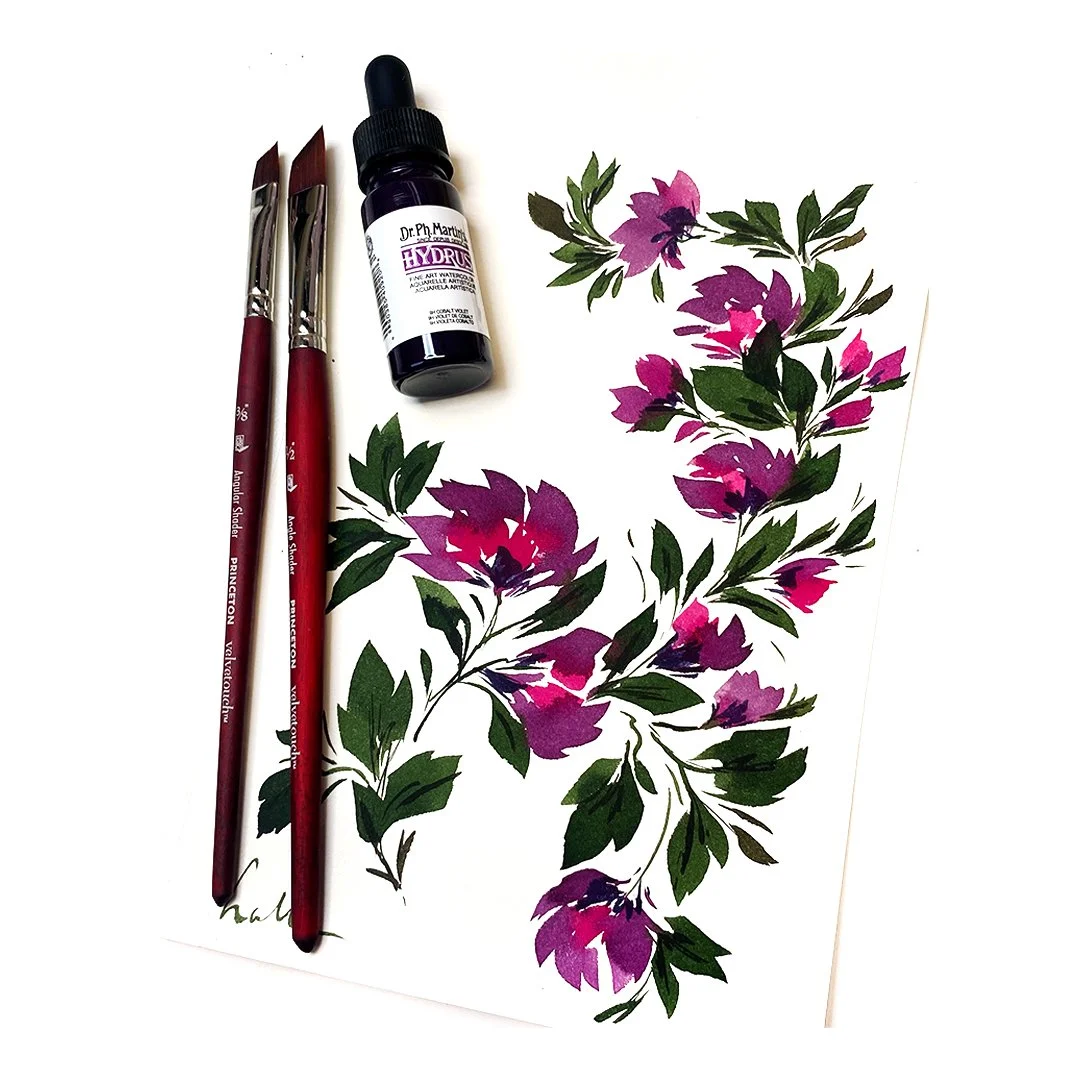
In this video, I’m diving into a painting session with an art print, exploring new color combinations.
Green has always been my favorite color, and I never tire of experimenting with its endless variety of shades.
There's something so soothing and exciting about the versatility of green—it feels like a gateway to nature!
I’m using Dr. Ph. Martin's Hydrus Fine Art Watercolor Inks for this piece, a medium I absolutely love for its vibrant,
rich pigments and archival quality. These inks are designed to last a lifetime.
It’s such joy to watch the shades blend an I love sharing this process with you.
I hope this video brings you as much joy and inspiration as it brings me while creating it.
Let me know your favorite shades of green in the comments, or tell me about a color palette you’ve been loving lately.
Enjoy watching!
Below is the final result that’s available in my shop!
Work in progress on an art print
Take a look behind the scenes at the process of creating an original art print!
It all begins with color, as shown in the first video, where I’m testing out different colors
to find the perfect palette. Choosing the right shades is a crucial step in the design process.
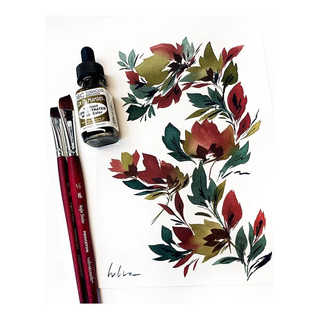
For this piece, I played around with various greens before settling on two favorites:
a rich, dark sap green and a soft olive green. These earthy tones provide a beautiful contrast and a grounded feel.
To complement them, I added a third color—a deep bordeaux red—which creates a striking, wintery color palette.
The combination evokes a sense of warmth and nature, balanced by the cool elegance of the greens.
I’m using Dr. Ph. Martin’s Lightfast Inks for this project, ensuring the colors are not only vibrant but also archival quality.
These inks are designed to stand the test of time, so the final art print can be enjoyed for years without fading.
From testing colors to finalizing details, each step of this process is part of the creative journey.
Hope you enjoy watching!
Below is a timelapse capturing the process of creating an original art print using the carefully chosen winter palette.
After testing and selecting the colors—a deep sap green, a muted olive green, and a rich bordeaux red—
I was ready to bring the design to life.
This timelapse is a glimpse into the behind-the-scenes effort that transforms an idea into a tangible work of art.
I hope you enjoy watching the process as much as I enjoyed creating it!
This is the end result that is available in my shop!
Blue monochrome floral
You really can’t go wrong with adding a blue monochrome floral to your collection.
These pieces are timeless and versatile, offering a sense of calm and sophistication
that makes them a perfect addition to any collection.
For me they are a way to warm up before diving into more complex floral paintings, as they
allow you to loosen up and get into the flow of painting without the pressure of multiple colors.
I absolutely love painting these! There’s something so relaxing and rewarding about working
with just one color, letting the focus shift entirely to the interplay of light and shadow,
and the organic shapes of the flowers themselves. To create a sense of depth and dimension,
one of my favorite techniques is to add a second layer using more concentrated ink.
This subtle yet impactful step makes the darker areas richer and gives the piece a more layered look.
When creating monochrome florals, I typically reach for a Payne’s Grey blue.
It’s such a versatile and beautiful shade, balancing between the softness of grey and the richness of blue.
It’s perfect for capturing the delicate forms and textures of petals and leaves while maintaining a cohesive palette.
Painting video of a blue monochrome watercolor floral


